

About three weeks ago, when scrolling through Twitter, I came across a tweet by Yosra Emad on how, while her designs were desktop-first, her development was mobile-first and my interest was piqued. I had covered responsive design in school, always aimed to have my websites responsive, and knew that one of the fundamentals of front-end development is that your website has to be responsive to different screen sizes, but I have always been a desktop-first developer. However, as I write this article, it is safe to say that I am a developer who creates websites mobile-first.
My journey to Mobile-First development:
As developers, we are always looking for ways to improve our skills. This is what led me to Frontend Mentor, a website where front-end developers can improve their skills by building real-life projects whilst working with professional designs. I decided to take on the Tip-Calculator Challenge. Frontend Mentor provides both desktop designs and mobile designs for their front-end challenges. I successfully created the desktop design, and the site was responsive but did not quite meet the mobile design specifications. I struggled with that for about 2 days before I decided to submit and get feedback on my design. It was this feedback that led me to the Responsive Design Course by Kevin Powell, a 21-day course, structured with mini-lessons (they will take a maximum of one hour) and coding challenges. I have learnt so much in the 21 days and I would highly recommend this course to anyone looking to grow their skills especially in responsive design.
Here are a few tips that I picked up:
Use of em and rem.
I have often used pixels(px) to set the font sizes of the HTML elements. 1em and 1rem is the equivalent of 16px, that is 1 em is equal to 16px and 1 rem is also equal to 16px. The difference between em and rem is that when setting font sizes using ems, the size of the element will always be set depending on the size of the parent element. However, with rem, the size of the element does not increase in relative size to the parent element (rem means root-em) and as always the size of the element will always be relative to the root.
When developing websites, you can use rem to set font sizes and em for the margin and padding.
View this codepen: Font-sizes with rem
View this codepen: Font-sizes with em
Play around with the font sizes of the body and you will note that the sizes of the p elements will change in the em based on the font size of the body while that styled in rem remains constant.
When em is used with margins and paddings, the margin and padding will always increase or decrease depending on the size of the element. This is because when used for margin and padding, the size will always reference the size of the element and not the size of the parent elements.
View this codepen: Setting margin and padding with em
Flexbox and the behavior of flex-items
Flexbox is used when setting the layout of HTML elements. This is set using the style display: flex;. Flex-items will always try to occupy the smallest possible size. To ensure that the elements will be of the same size, set the width of the flex-items to 100%. You can also set the width of the flex-items in %.
View codepen: Flexbox and flex-items
Note: There is so much more to learn when it comes to flexbox. I recommend taking the course or getting tutorials to learn more about flexbox.
Making images responsive
Even when the site is responsive (before we add any CSS), you may face the challenge of non-responsive images which may resort to side-scrolling. To make your images responsive, set the size of all your images to max-width: 100%;, which ensures that the size of your images will always decrease as per the screen size and never increase beyond the image's original size.
Max-width and when to use it
When sites are responsive, the text container will continue to increase with the size of the screen. While this may not be an issue in smaller screen sizes, with larger screen sizes, the text will become difficult to read due to the movement of the eye from one screen end to another.
To prevent this, we can set a max-width to a certain size for example set the max-width: 800px; which means that the width of the text element or container will grow up to 800px. After 800px, the text width/container will no longer increase which makes it easier for the reader to read text.
Media Queries and the importance of mobile-first design
Media queries are usually set as below:
This assumes that the media queries are being set for all media types.
Media queries are used to style and give a different layout for different screen sizes.
Mobile-first development means that as developers, we first style our sites to be responsive for mobile and then deal with the layout for bigger screen sizes.
To do this, we will use the following media query:
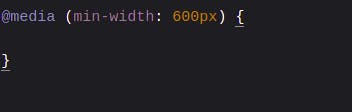
This means that the site will be styled up-to-the size of 600px after which the new styles in the media query will take effect.
Given the nature of CSS (Cascading Style Sheets), media queries will ideally be placed at the end of the style file so the new styles are picked.
While you may not be provided with the mobile designs, it is important to train yourself to always develop your websites' mobile-first and then work your way to larger screen sizes. - Kevin Powell
Here are some of the things I unlearnt
Setting fixed widths and heights
I have previously been guilty of setting fixed widths and heights when styling elements. With a website-first approach to development, there was always the challenge of an overflow of text or images in smaller screen sizes. To avoid this, it is important that you avoid setting the widths or heights of elements and instead take advantage of padding to set the desired heights and use %'s to set the width of the HTML elements.
It is important to note that max-width may be interpreted as width.
Setting margins and paddings in px
Rather than setting your padding and margins in pixels, set your margins and paddings in ems so that the set margin and paddings will always be responsive to the font size of the element.
Conclusion
Responsive CSS is definitely a huge topic in itself and as developers, we should always aim to make our websites as responsive as possible. I hope this article gives you a few insights on how to improve your projects and encourages you to take the Responsive CSS course by Kevin Powell.
If this article has been helpful in any way, kindly leave a comment below, I would love to hear from you.